13 Dramatic shades of paint for a stunning powder room
Do you love color and drama but afraid to go too wild? While I generally prefer neutral colors for the main living areas of the home (with pops of color in the accessories to jazz things up), the one place that I love to go vibrant on is the powder room.

Powder rooms are small and defined spaces. Rather than going with a safe neutral, consider choosing a vibrant shade of paint that will allow your personality and sense of style to shine through.
 It’s a great way to use color strategically. And, it can be a great weekend project to give your space a makeover so you can take your ho-hum powder room from drab to fab..
Powder rooms are often cramped, and there isn’t much space for wall art or other accessories. That’s why paint can make a huge difference. Paint then becomes the main decor element, and it’s a room you can easily take a risk on. Furthermore, it’s one of those rooms that you can change up frequently and on a budget, especially as styles and preferences change.
Choose your favorite color. It’s okay to go dramatic, or wild or even dark. Pick what you love. And, remember, if you’re afraid that the color may be too bold, you can always add some sort of white wainscoting or bead board. You may also consider doing some bold stripes with two similar shades (one a lighter, one a bit darker).
Please note that this article contains affiliate links. You can read my full disclosure at the bottom of the page.
Side note: Some helpful tools for DIYers
If you’re planning to paint yourself, here are some of the best tools you can use to make your painting faster, easier and better. And, you can buy these items on Amazon by following the links.

![]() Here are some painting tools that may come in handy if you’re going to do the painting yourself. Also, be sure to check out my article on the Top 10 DIY Painting mistakes and how to avoid them. The products below can be found on Amazon and delivered straight to your door.
Here are some painting tools that may come in handy if you’re going to do the painting yourself. Also, be sure to check out my article on the Top 10 DIY Painting mistakes and how to avoid them. The products below can be found on Amazon and delivered straight to your door.
- Painting brush – this one costs a bit more, but it’s totally worth it. It will help you paint faster and more accurately. If you’re going to paint yourself, don’t skimp here. Incidentally, this is Amazon’s Choice as well.
- Painter’s tape – a must have. Use for all the trim as well as ceiling area
- Paint roller kit – this includes a tray. Use the brush for the edges and the roller for main areas of the wall (and ceiling).
- Drop cloths – Yes, you’ll need them for sure. Some people have some on hand, but often not enough if you are doing many rooms.
Do you need any paint shade fan decks?
Amazon can help with that. It’s so much easier when you have the full color wheels and can see all of these in your own home (vs. going back and forth to the store MULTIPLE times).
Sherwin Williams Benjamin Moore

![]()

![]()
13 Dramatic paint colors for Powder Rooms
 Here are a few of my favorites. Warming: You will hate some of these…and you will love others. I tried to select a broad array of color choices since everyone’s taste is different. Some people love blues, others love greens; some like to go more dramatic with a bright color and others like to go a bit more subtle.
I’m here to tell you that there is no wrong answer here. Choose what you love. And, if you choose a slightly different shade or go a bit darker or lighter, that is fine. It’s your powder room, so do what you adore.
Hot Pink
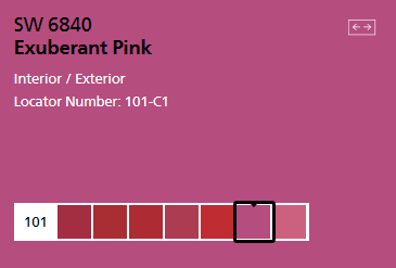 This is a super fun way to have a dramatic impact. One of the boldest pinks is Sherwin William’s Exuberant Pink 6840. It’s interesting to note that pinks are flattering to most people’s skin tones. This color tends to look best with dark hardwood floors or white/light tile flooring. Moldings should be a clean bright white.
Bright Orange
 This color is very polarizing. Orange is one of those polarizing colors. Some people love it and some people hate it. If you love orange, consider Osage Orange. It’s a bright and friendly orange that’s welcoming. It’s a strong color, so it’s really the only color you should use in the room (except for whites for the trim and other items in the room.
Fluorescent Green
 Try Center Stage from Sherwin Williams. This is fun and playful color. It works because it’s unexpected. And, in small doses, it really works. It works best with brushed nickel hardware and white trim. Black, white and silver accents work well together with dark hardwood floors or light tiled floors (e.g. carrara marble). Make sure you have good lighting, and a modern light fixture will brushed nickel will make the room look stunning.
Soothing Greens
 If you love green, there are several other options to consider. Greens are sometimes challenging to choose as they sometimes look too minty or have too blue in them…or look too mossy or olivy. Here are 3 ways to approach green, pending on the tones you prefer. I like all of these because they are soothing. First is Aloe which is green with some aqua undertones.
Next is Rainwashed. This color has a bit more blue and gray in it, so it’s more subtle. And, the third choice is reclining green which is the most green of the three.


Paint Samples


Now, let’s talk about samples…
It’s always best to test the paint colors in you own home and own lighting. The colors do look different pending your lighting and can even look different room to room.
You can definitely go to your local painting store to buy some samples (and a brush…be sure to paint with 2 coats), but I have a MUCH EASIER way for you. Check out SAMPLIZE.

Samplize offers 12” x 12” peel and stick paint samples that are EASIER, AFFORDABLE and more ENVIRONMENTALLY FRIENDLY.
Here are a few reasons why I recommend Samplize to my clients:
- Samples come right to YOUR DOORSTEP in 1-3 business days, pending on location
- At $5.95, they’re more affordable than the samples/brushes/foam boards than traditional samples…and of course easier and way less messy
- If you keep the samples on the white paper, you can move them from wall to wall and room to room
They are amazingly accurate as they are made with 2 coats of real paint, so they are color correct.
Visit the SAMPLIZE website HERE.
Soothing Blues
 Blues are my favorite. They are peaceful and relaxing. There are so many choices for blue, and it really depends how light or dark you want to go. Choose the blue that makes you say “ahhh.” You really can’t go wrong with blue, and blue tends to work with virtually all flooring colors. I love all of these.
Which is your favorite blue?


Navy
 Navy has become such a hot and popular color. But, it’s sometimes challenging to find the right navy blue – one that dark and deep enough, but not too dark, as it can start to look like black, especially in a powder room. My favorite Sherwin Williams navy is Commodore blue which has a great balance of color and depth. For powder rooms, if you’re going to use navy, make sure you have good lighting, white trim and brushed nickel hardware.
Smoky Grays
 Light grays almost always work in powder rooms, but sometimes, you just want a bit more drama and depth of color, especially if you want to contrast with the floor. Earl Grey is a beautiful gray that is more of a mid gray, so it feels more upscale.
 Another gray option is Poised Taupe. This was Sherwin William’s Color of the year last year. When you look at it by itself, it reads gray. But, when you put it up against other grays, you’ll see it has some purple undertones, and this give it a more upscale look due to the complexity of the color.
Do you need any paint shade fan decks?
Amazon can help with that. It’s so much easier when you have the full color wheels and can see all of these in your own home (vs. going back and forth to the store MULTIPLE times).
Sherwin Williams Benjamin Moore
![]()
![]()
Related articles:
- Most popular shades of gray paint
- Best paint colors to sell your house
- Farmhouse paint colors
- Best paint colors for dark hardwood flooring
- Why it’s important to seal your grout…and how to do it yourself
 Did you find my tips helpful? If so, feel free to buy me a coffee and support my blog

